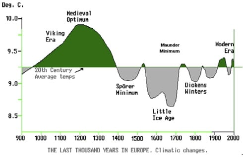
Sunspot cycles vary in length from about 9 to 14 years. Some peaks are high, others low. The valleys are usually brief, lasting only a couple of years, but sometimes they stretch out much longer. In the 17th century the sun plunged into a 70-year period of spotlessness known as the Maunder Minimum that still baffles scientists. The Maunder Minimum coincided with the middle — and coldest part — of the Little Ice Age, during which Europe and North America, and perhaps much of the rest of the world, were subjected to bitterly cold winters. The postulated reason why decreased solar activity (correlated with decreased sun spots) leads to global cooling is that there is reduced solar wind, which decreases the geomagnetic shield of the earth from cosmic rays, resulting in increased galactic cosmic ray flux to the earth, which cause formation of more low-level clouds and more snow, which in turn cause more albedo effect (more heat reflected), and therefore colder climate.

Above: Yearly-averaged sunspot numbers from 1610 to 2008. Researchers believe upcoming Solar Cycle 24 will be similar to the cycle that peaked in 1928, marked by a red arrow.
Right now, the solar cycle is in a valley--the deepest of the past century. In 2008 and 2009, the sun set modern age records for low sunspot counts, weak solar wind, and low solar irradiance. The sun has gone more than two years without a significant solar flare. Take a look at the widget above right - zero sunspots- for far longer than the next solar cycle had been predicted to start. Might this be part of the reason for the "travesty" (quoting a climategate email) of global cooling over the past decade?
Solar activity also affects the production of beryllium-10, with variations in that cosmogenic isotope studied as a long-term proxy for solar activity, shown in the graph below (note "inverse" time scale and correlation to periods of the little ice age, the medieval warming period, and warming since the Maunder minimum)

I recently stumbled across a fun website here which has an interactive plotting ability for sunspot and TSI (total solar irradiation) data, as well as a variety of HADCRUT3 thermometer datasets, and GISTEMP, CO2, etc. datasets which allows one to interactively plot 2 or more datasets as well as perform simple statistical methods, including moving averages, normalization, detrend, first derivative, regression, high & low pass filters, etc. So, I decided to do a simple plot of normalized sunspot vs. HADCRUT3 variance-adjusted global mean data over a variety of moving average periods. Since sunspot data varies markedly throughout each sunspot cycle, and the sunspot cycles themselves follow a secondary approximately 11 year trend, and the paper cited above found "70-90 year oscillations in global mean temperature," I decided to look at a very-long-term 75 year moving average of sunspot data along with a shorter 58 year moving average of HADCRUT3. (These are arbitrary figures and very similar plots are obtained with all varieties of very-long-term moving averages).
Here is the plot obtained:

Quite amazing eye-ball correlation IMHO (albeit the woodfortrees.org website does not provide correlation statistics), even more striking than the Science paper (which looks at a related but different correlation-namely length of solar cycles to temperature and used much shorter 11-year moving averages), and I didn't even have to flip any data series, "apply very artificial adjustments," "fudge factors," filter, overlay second order polynomials after 1930, throw out negatively correlated data or not use data during uncorrelated periods, or further massage-the-hell-out of the data like the IPCC gang. To quote the expert comments in the IPCC TAR (Third Assessment Report) (file ipcc-tar-master.rtf):
"This individual review paper focuses on IPCC's three most essential modelling and core parameter errors. The impacts on all modelling results would be so tremendous that if the TAR would be corrected for these errors, there would hardly be any more justification for it. So this paper addresses only few individual TAR fallacies, but focuses on the nondisclosed flawed science it is based on.
Solar impacts
Taking into account the impact of solar variability on global warming, best fit studies have revealed that solar forcing is amplified by at least a factor 4. By leaving out this 'Svensmark factor' and using an exaggerated aerosol cooling, IPCC maintains a CO2 doubling sensitivity of 2.5 \'b0C that is about a factor 3 too high."
If you would like to reproduce this graph, you must first file a FOIA form, which will be denied. Just kidding, here are the parameters used to produce this plot:

See also here
No comments:
Post a Comment